Calb Space • Corporate Branding
Gamifying Islamic learning to make religious education accessible and engaging
OVERVIEW
Designing Calb Space, a gamified Qur'an learning app, and developing its digital branding website as a university project
Tasked with a corporate branding assignment, I conceptualized the UI/UX for the Calb Space mobile app and developed its promotional website. The platform serves as a digital touchpoint that redefines religious education through modern aesthetics and an engaging interactive experience.
APP DESIGN
The Core Product Experience
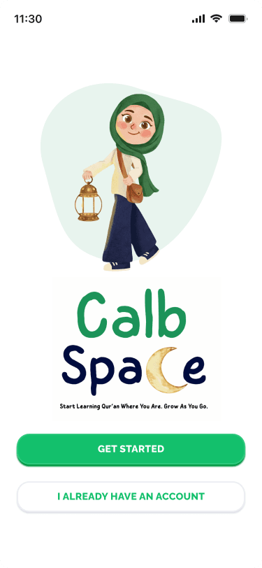
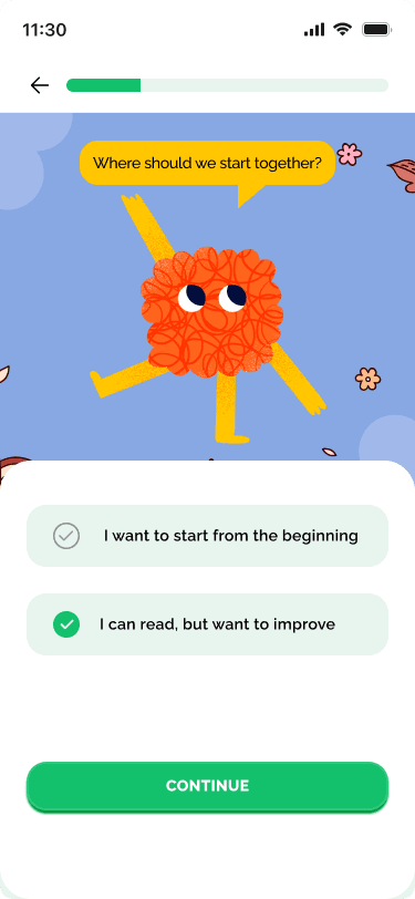
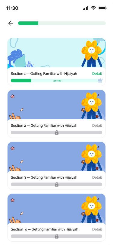
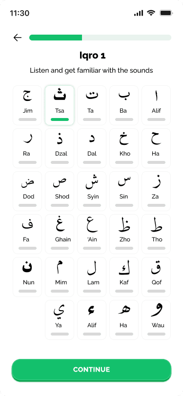
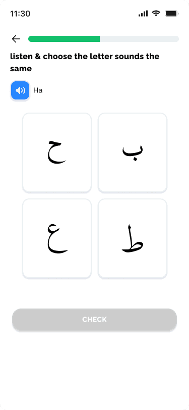
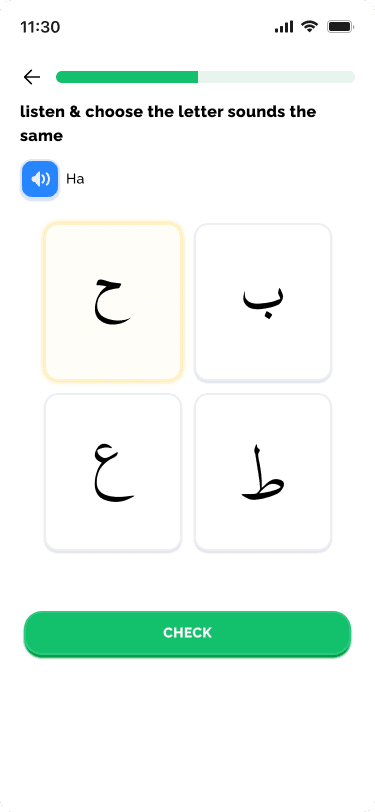
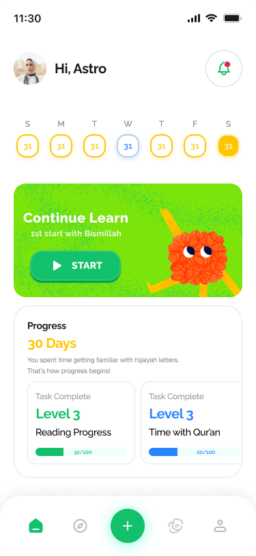
The core of Calb Space is its gamified mobile app. We designed an intuitive interface with a structured learning path, interactive quizzes, and character-driven feedback to keep students engaged.

BRANDING
Friendly and approachable visual identity
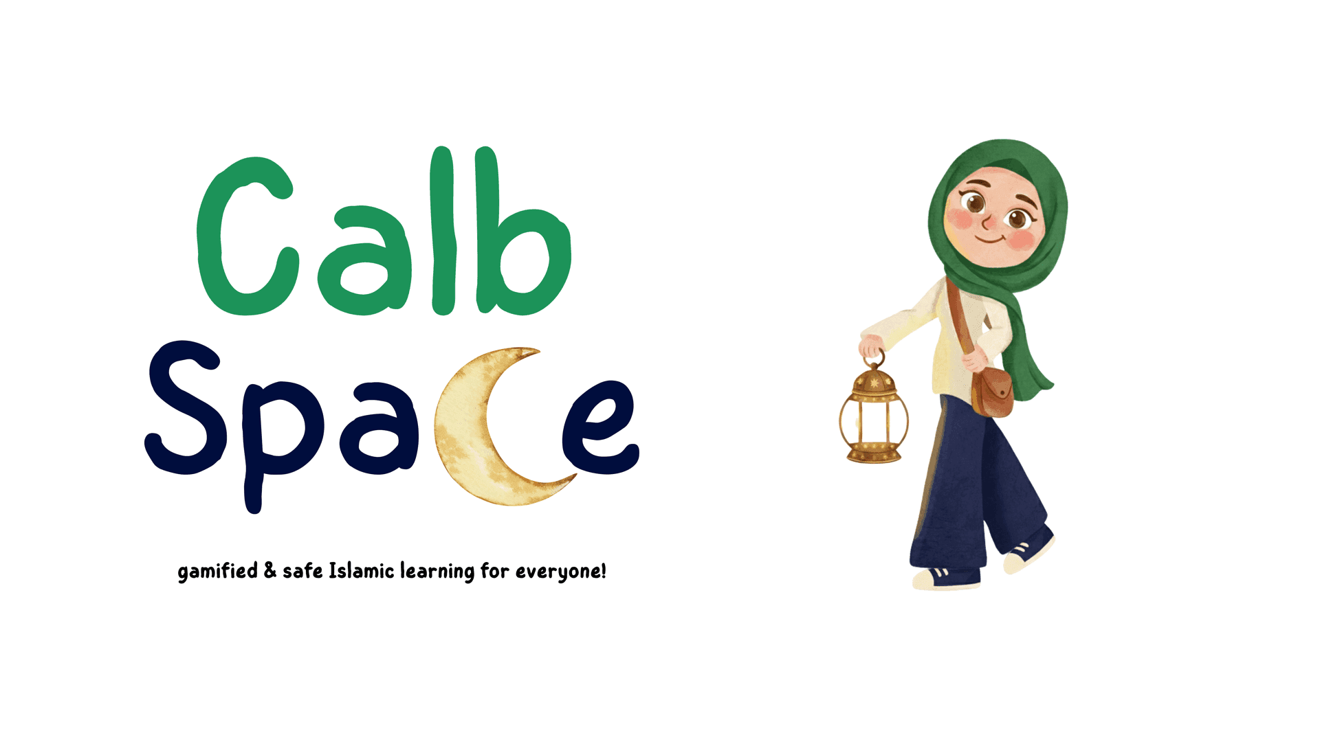
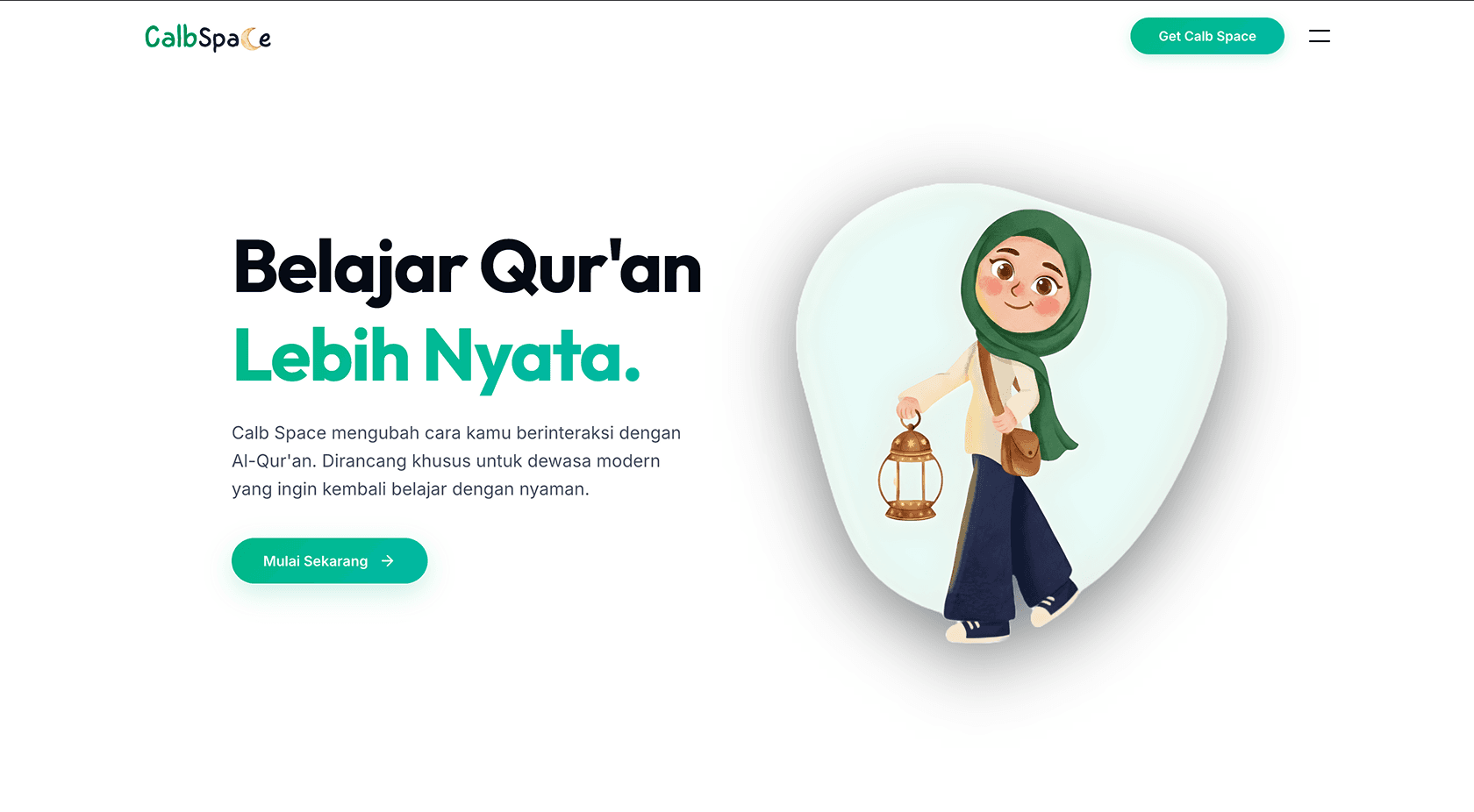
To counter the intimidating nature of traditional learning, Calb Space focuses on approachability. Custom illustrations like "Nura" and the "Calblings" create a brand voice that is encouraging, playful, and supportive.
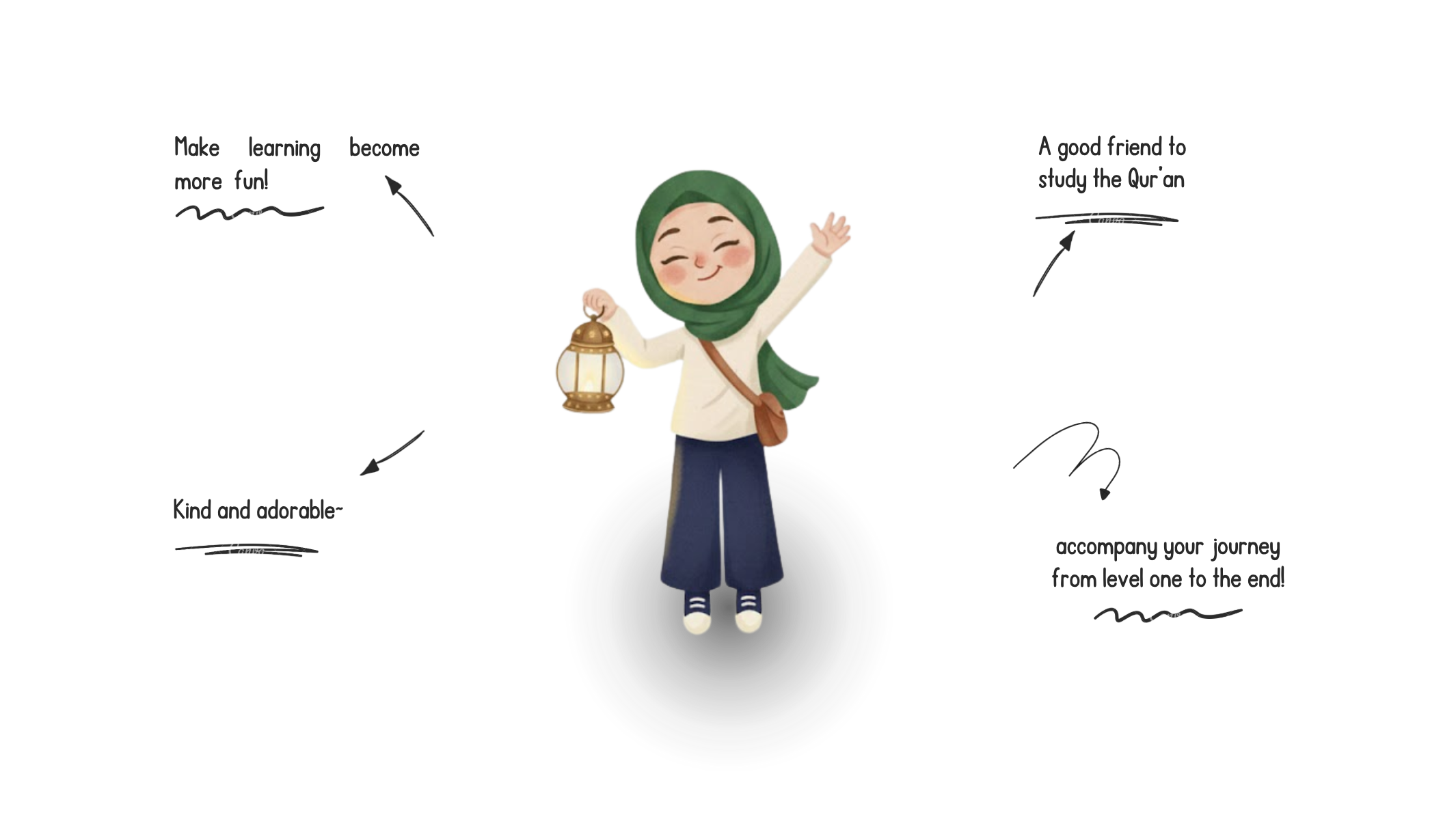
Girl Character (Main Mascot)
Nura represents modern Muslims seeking to reconnect with their faith at their own pace. She makes the journey of restarting Islamic learning feel lighter—like a kind friend who guides you, celebrates your achievements, and makes the experience human and spiritually uplifting.
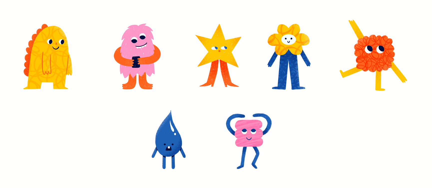
The Calblings: Playful Companions
These colorful, friendly creatures accompany users on their journey, adding gamification and joy that turns complex Qur'an learning milestones into fun, rewarding achievements.
CONCEPT
Scroll-triggered interactions and progressive disclosure
We used progressive disclosure to avoid overwhelming users. Scroll-triggered animations reveal features, characters, and benefits step-by-step.
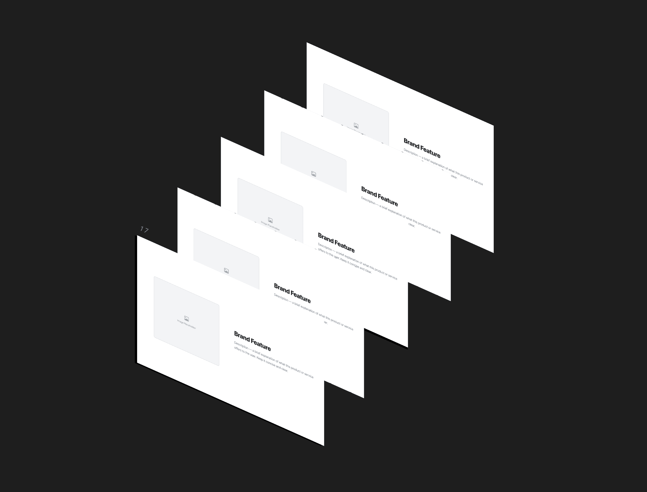
By treating the viewport as a stage, I ensured that every feature highlight, from the character introductions to the level progression system, was delivered with surgical precision, preventing cognitive overload and keeping the user curious about the next "unlocked" section.
APPROACH
Translating Figma designs into responsive components
The main challenge was perfectly translating complex, multi-layered Figma designs into a responsive web environment across all devices using CSS Grid and Flexbox.
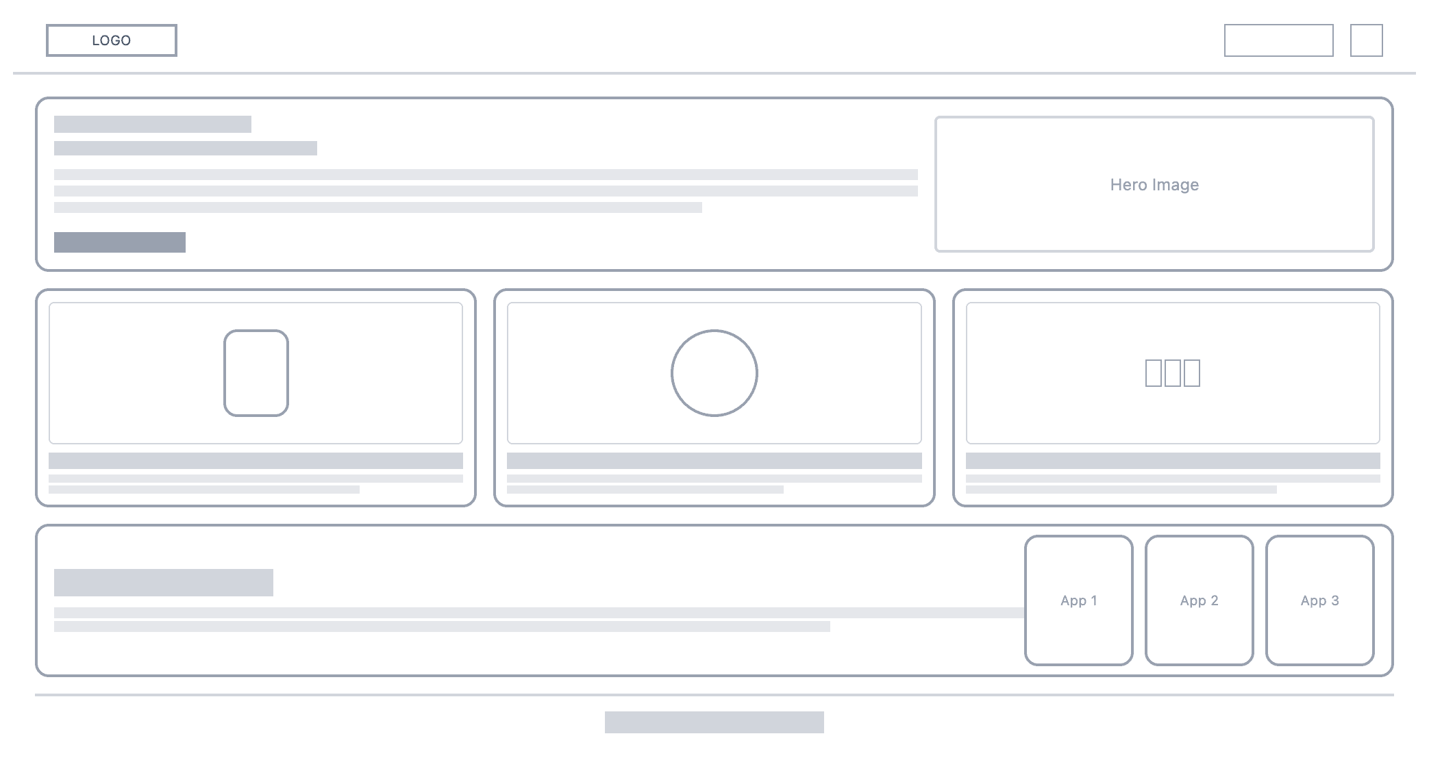
DESIGN
Vibrant colors and inviting visual elements
We curated a moodboard of warm colors and soft UI elements to create a welcoming, playful, yet structured digital environment—moving away from rigid educational interfaces.
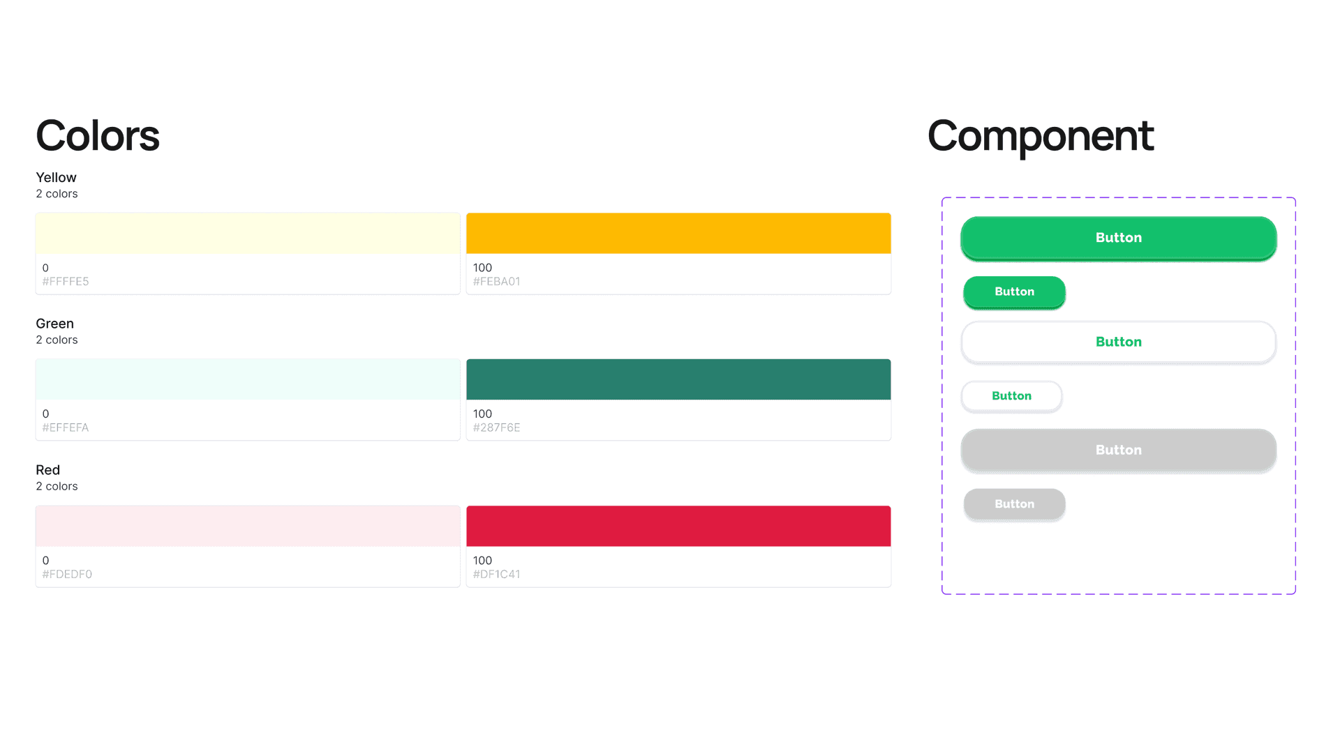
This visual direction informed every decision, ensuring the interface elements harmonized with the character illustrations. By establishing these visual principles early, I ensured that the technical execution would perfectly align with the intended brand emotion.
OUTCOME
A functionally efficient and emotionally resonant interface
The result is a high-performance branding site that goes beyond a digital brochure. It effectively communicates Calb Space's value through gamified interactions, blending functional efficiency with emotional resonance.
REFLECTION
What I learned & Technical Takeaways
Prioritizing interaction design over static layouts successfully bridged functionality and engagement. The editorial scrollytelling experience eliminates fatigue and transforms the site into an interactive journey.
1. Sticky Section Stacking
Utilized sticky positioning and Z-index layering to create a "card-pulling" effect, where new content sections slide over the previous ones, maintaining context while introducing new information.
2. Progressive Disclosure
Leveraged Framer Motion to orchestrate entry animations that only trigger when elements enter the viewport, ensuring the user's focus is always on the active feature.