CopasinID • Shipped 2025
Simplifying plagiarism detection so students can focus on their research
OVERVIEW
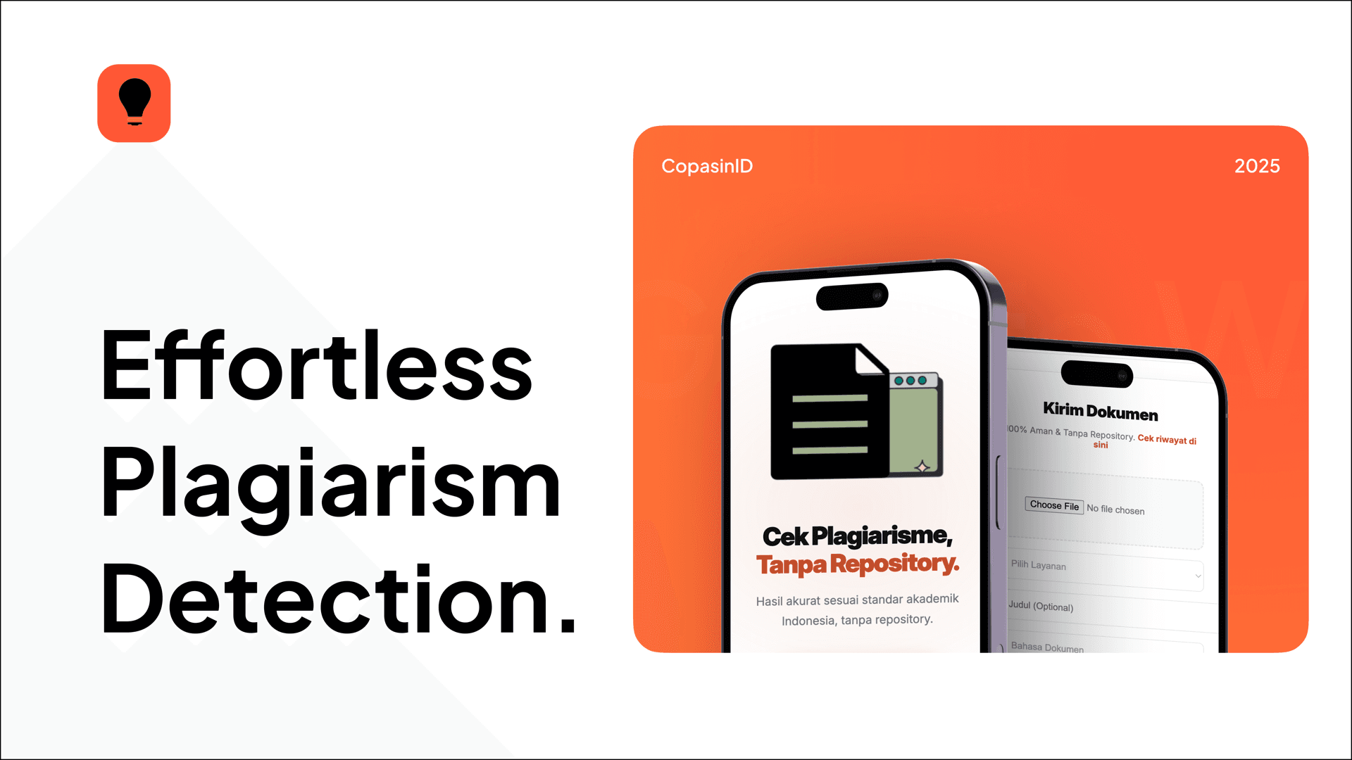
CopasinID is a web-based plagiarism checker, originally developed as a university course project
We were tasked with creating a service-based website, so we decided to build a straightforward utility that helps students by delivering similarity results instantly for verifying their theses, reports, and research papers.
PROBLEM
Current plagiarism tools are overly complex and notoriously difficult to use
Students often face frustration with cluttered interfaces. Core text-checking functions are typically hidden behind unnecessary clicks and irrelevant features.
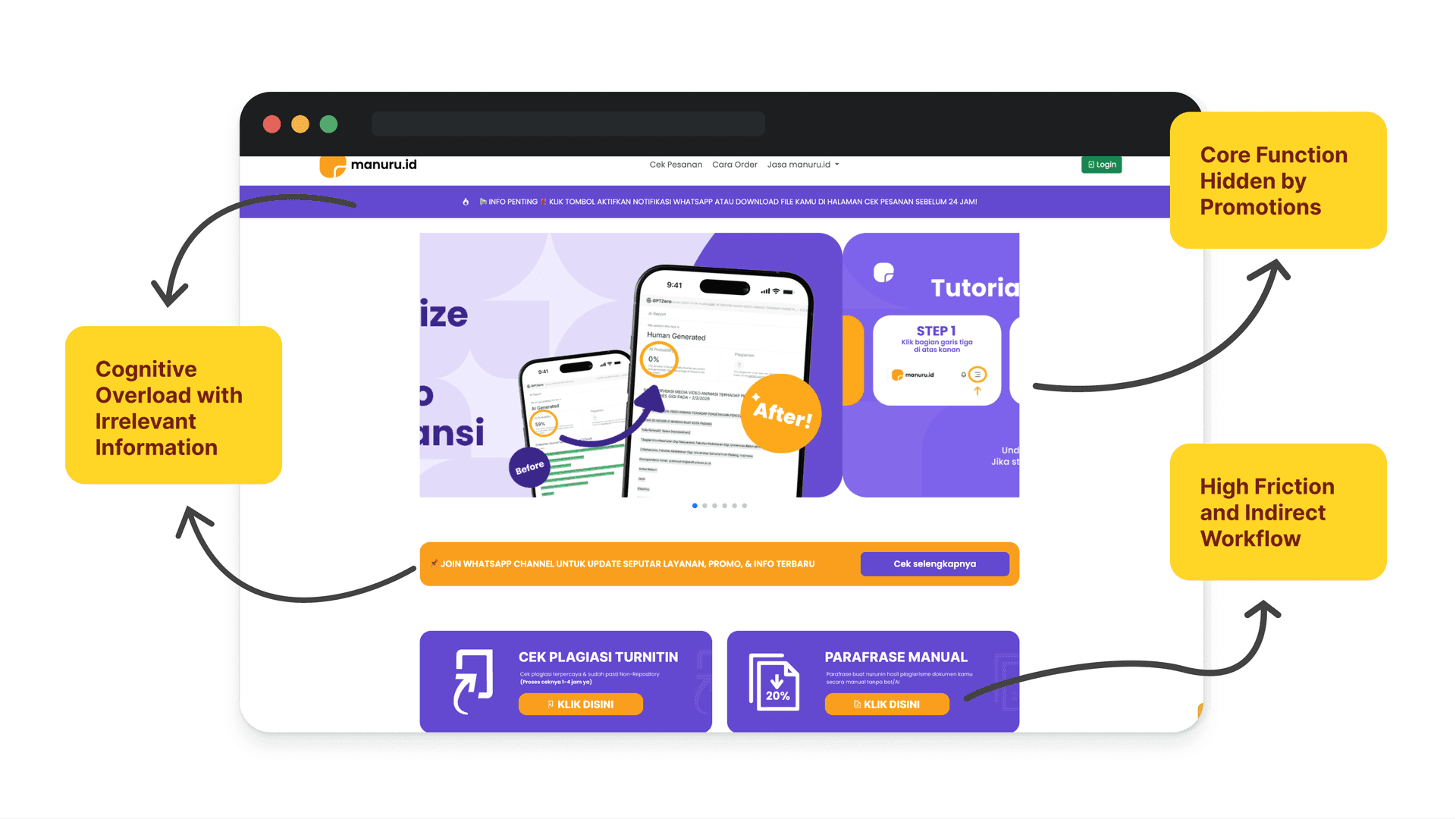
This complicated process was the biggest friction point, causing frustration and drop-offs right before submission.
How can we make checking an academic document as efficient and straightforward as possible?
SOLUTION
Frictionless and intuitive user experience
We simplified the interface to focus purely on usability, stripping away unnecessary elements so users can intuitively navigate and focus on checking their text.
A streamlined, straightforward process
The workflow is incredibly direct: users paste text, click a button, and instantly receive their similarity percentage without complex configurations.
APPROACH
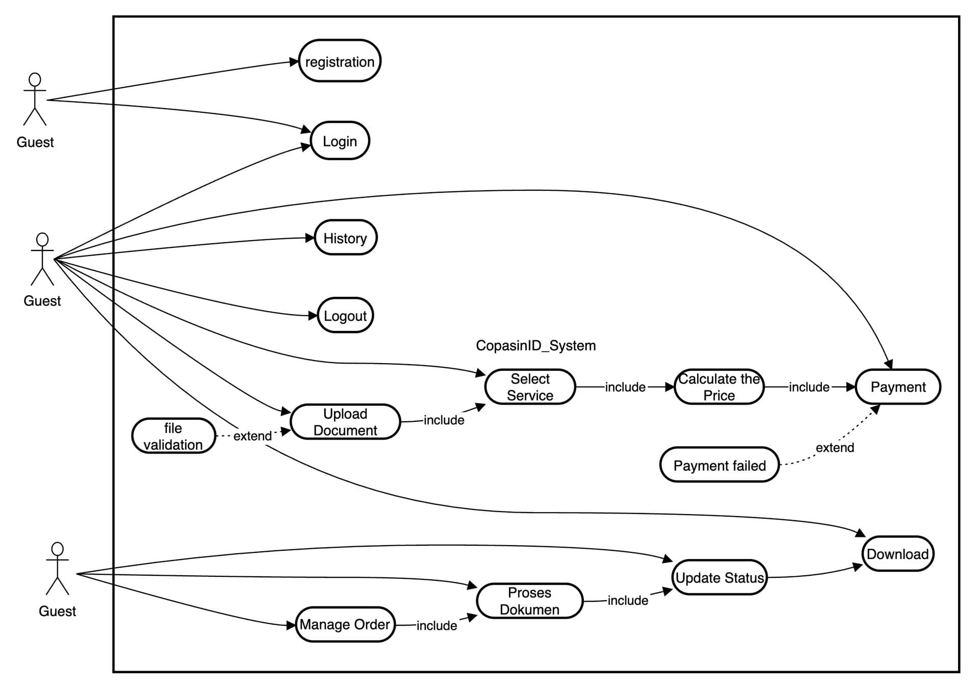
Structuring the system logic with UML
Before coding, I mapped core behavior using Use Case and Sequence diagrams to define the submission process, eliminating unnecessary interactions for a direct user flow.
Translating function into Figma prototypes
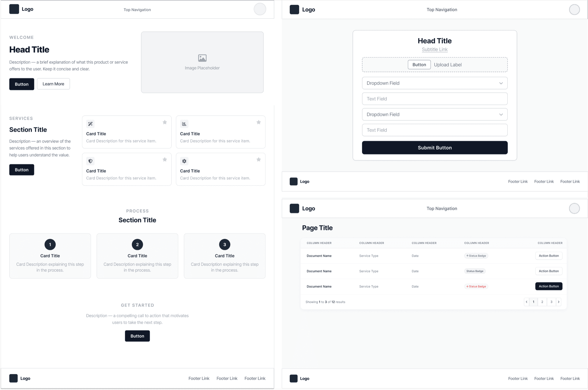
Figma was used strictly to lay out application utility based on UML logic. The text input was placed front and center to ensure a straightforward and easy-to-use interface.
DESIGN
A functional visual system for clarity
Visual elements like color and iconography were chosen strictly to support usability. A high-contrast minimalist palette and simple icons reduce cognitive load and keep focus on core utility.
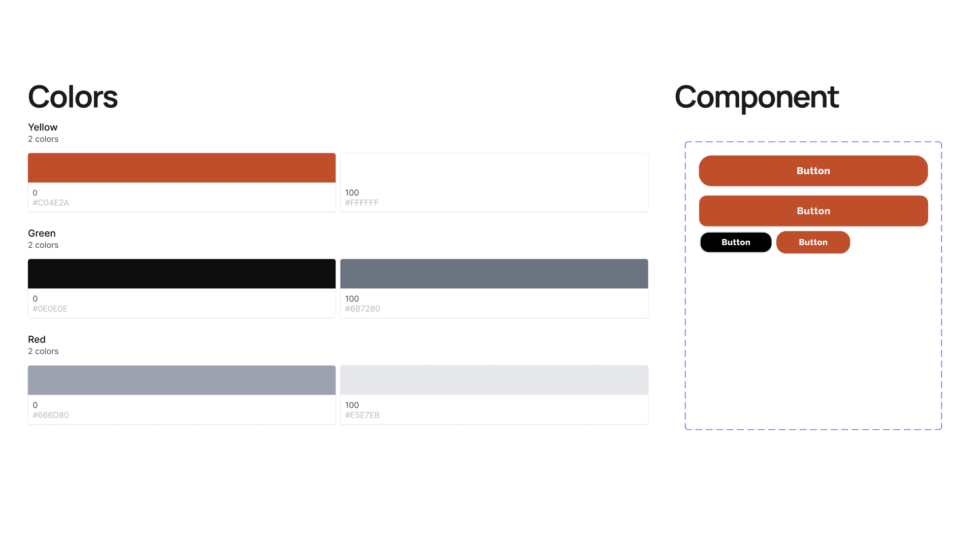
I built a centralized design system for consistent spacing, borders, and color scales. This ensured a completely seamless transition from design mockups to the coded application.
OUTCOME
Delivering a direct text verification utility
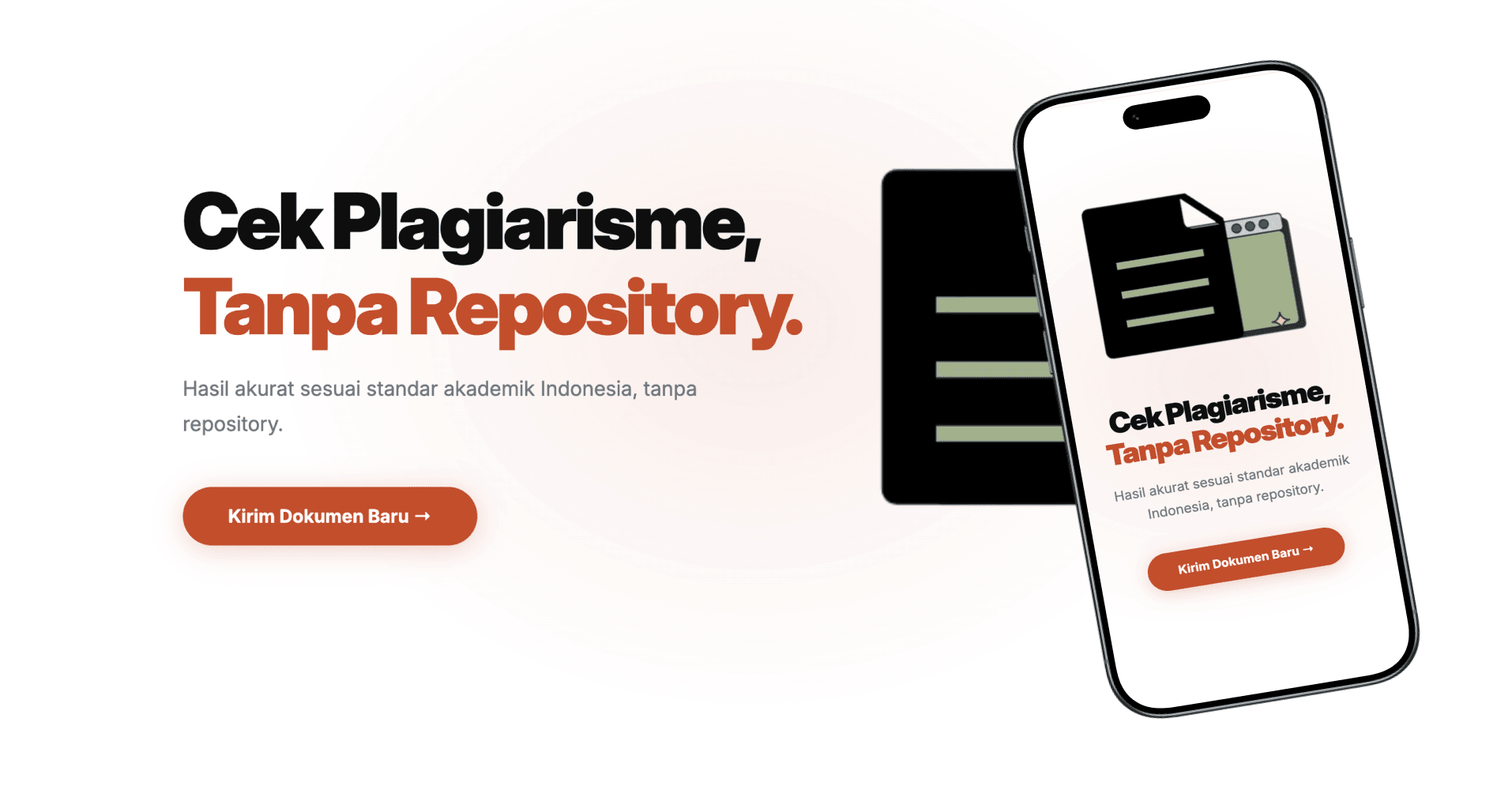
The final responsive web app focuses entirely on the checking workflow. By eliminating unnecessary steps, it provides a straightforward route for users to input text and directly receive similarity percentages.
REFLECTION
What I learned
Good code controls user focus
Translating a complex academic workflow into a minimalist interface taught me that every design decision either helps or hinders the user's primary goal.
Complexity needs simple interfaces
Building a tool with complex background processes taught me that the user interface should remain as straightforward as possible. Hiding the technical complexity behind a clean design drastically improves usability.